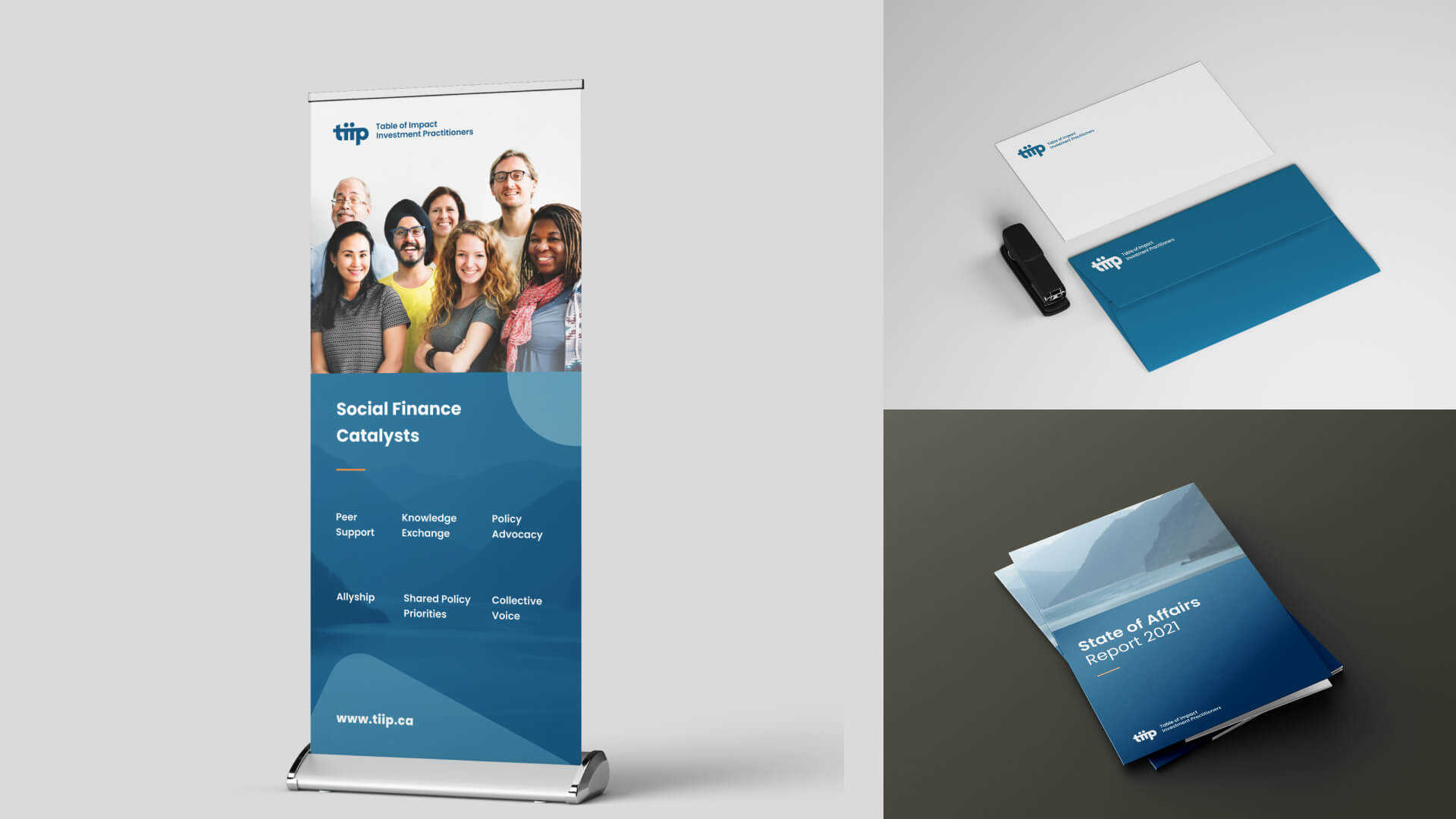
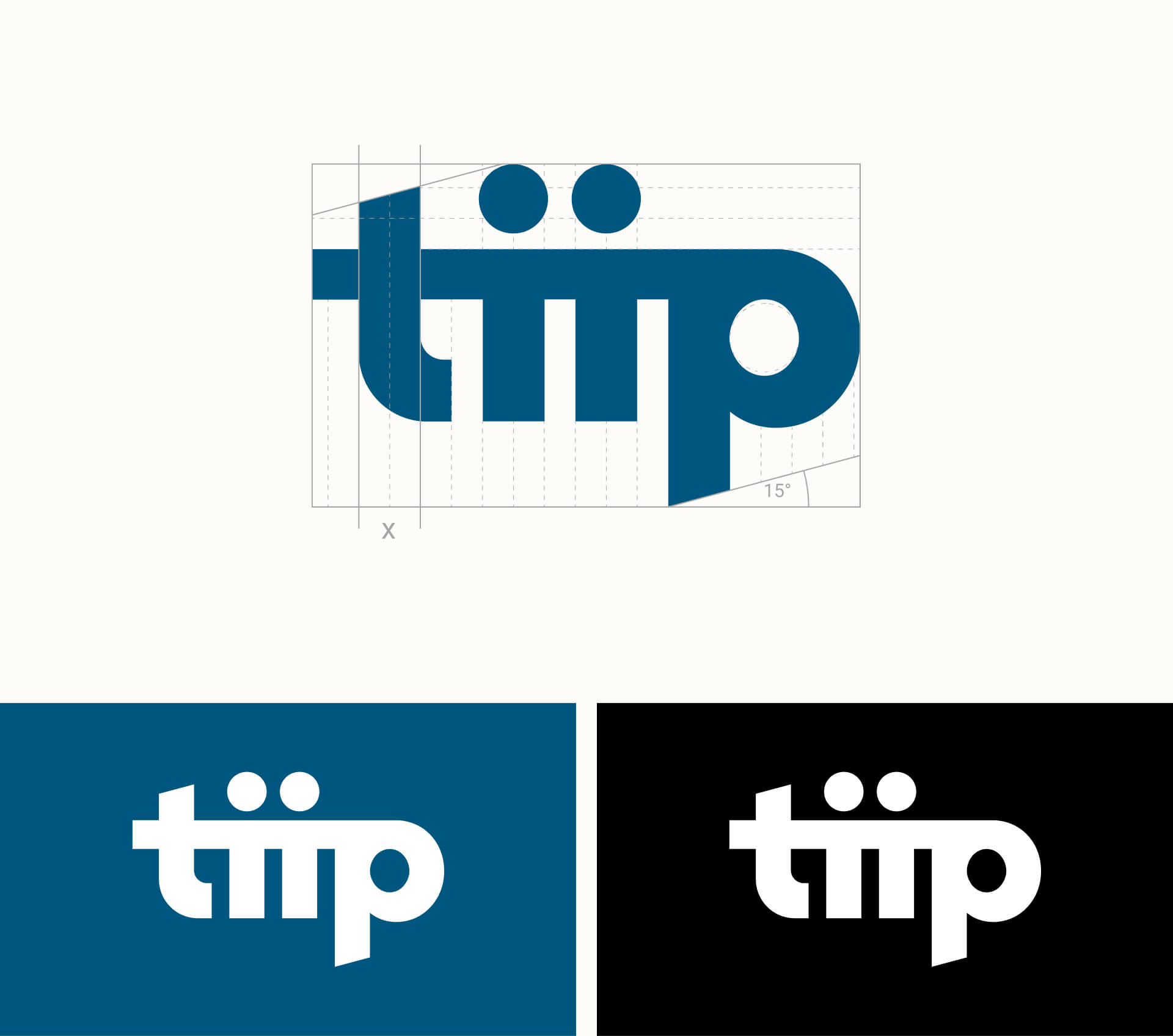
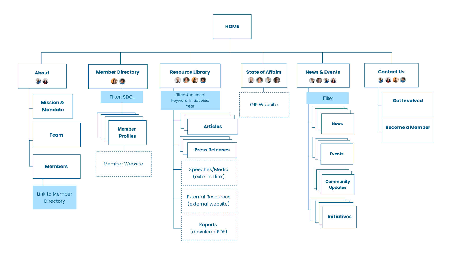
TIIP Brand Refresh

Creating an inspiring, approachable and mindful brand for social finance.

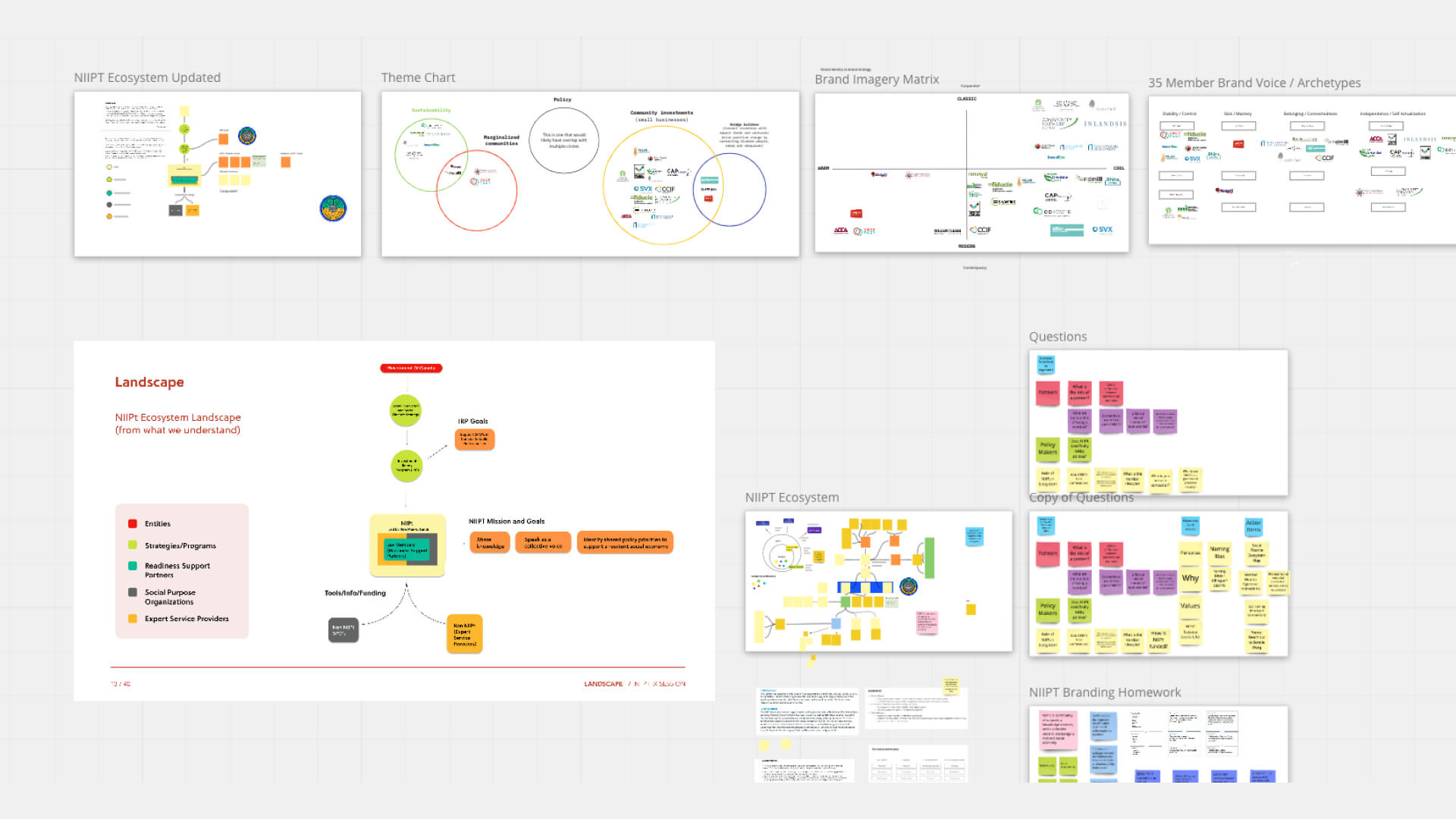
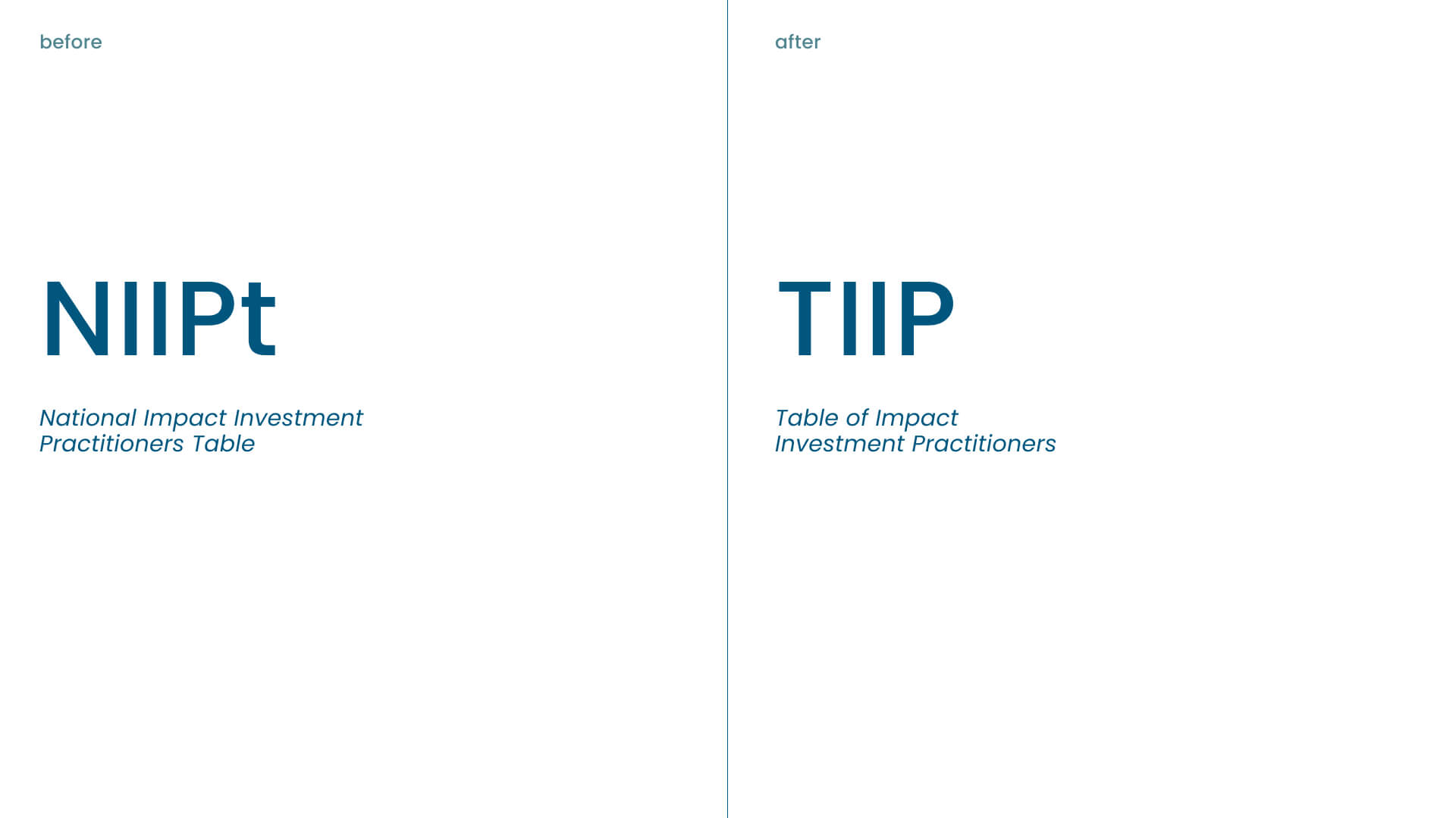
As a part of the Railyard 2020 team, we were tasked with building a comprehensive brand identity, strategic foundation and website to support TIIP’s (Table of Impact Investment Practitioners) robust network across Canada.

Context

Completed as a cllent project for Railyard 2020 : Dossier Creative INC.

Role

Design Intern - Brand Strategy, Visual Design, UX Stategy & Design

Team

Railyard 2020 Cohort, Advised by Dossier Team

Deliverables

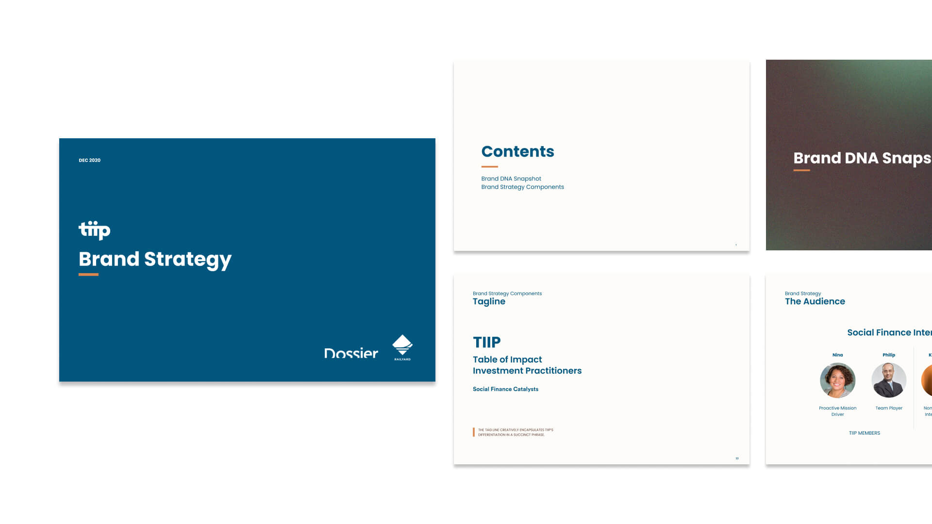
Brand Strategy, Brand Identity, Name, Brand Guidelines, Website Design

Preview of TED voices

Overview

Who is TIIP?

The Table of Impact Investment Practitioners (TIIP) brings together the expertise and energy of Canada’s social finance fund managers to power more economically generative, environmentally sustainable, socially just and inclusive communities.

With a network of 35+ social finance leaders across Canada, they amplify and accelerate capital into social finance initiatives across the country.

Research

Before diving into the brand strategy, we wanted to solidify our understanding of the social finance landscape in Canada. Who were the key players in the space? What was TIIP’s funding structure? What were some of the trends and challenges we needed to be aware of?

From secondary research, ecosystem mapping and 6 stakeholder interviews, we were able to understand how TIIP was at the forefront of the social finance ecosystem in Canada.

Research

Brand Strategy

Our biggest challenge was building a brand strategy that effectively represented TIIP’s vibrantly diverse community of member-funds, ecosystem partners and policy makers.

From our research, we positioned them as the 'heroes' of social finance, as an inspiring team of leaders whom the social finance practitioners and intermediaries look to for guidance and insight.

Brand Strategy

Naming

TIIP's previous name NIIPt (National Impact Investment Practitioners Table) was descriptive, but difficult to pronounce.

As a highly respected community of practice, our challenge was to update the existing name, while retaining the brand equity they had developed over the years.

We kept the ‘T’ (for ‘Table’) to maintain familiarity and reshuffled the previous acronym to create a simplified name that reflects the brand’s values and personality.

Names Before and After

Visual Identity

From its inception, TIIP has embodied a people-centred approach to investment. Our task was to go against the grain of the often intimidating financial sector and create a visual identity that made social finance feel inspiring, approachable and mindful.

Keeping the blue to maintain professionalism, the updated visual language introduces a grounded color palette to convey the brand’s collaborative and community-based leadership. The orange accents are used to reflect TIIP’s vibrant, confident and innovative characteristics.

Art Direction moodboard
Visual Assets

Identity

The extended ‘T’ represents a table top while the two ‘i’s’ show the unification and mobilization of TIIP’s members. The upward angles show TIIP’s action-oriented approach to inspiring and driving the social finance movement.

Art Direction Collateral

UX Strategy

The goal for the UX strategy was to enable TIIP’s diverse audience to easily navigate relevant resources and directories on the site. Collaborating with the TIIP team, we synthesized and prioritized the goals of TIIP’s stakeholders together to guide the homepage layout.

By clearly defining each CTA for both primary and secondary audiences, we were able to design the content flow of the wireframes to match the motivations of each audience.

UX Strategy of Stakeholders

Reflection

The exciting aspect of this project was learning about the social finance domain and understanding all the key players. Because TIIP is an overarching organization of leaders a challenge we faced was creating a strategy that accounted for their numerous different audiences. By asking specific questions and working closely with the TIIP team, we were able to understand who were designing for.

Impact

The new brand has been launched and is visible at their website here. The success of the project was being able to bring the people and community into focus within the domain of finance.

Testimoniala