Overview
The Client
Located in New York, The Whitney Museum of American Art is dedicated to showcasing twentieth-century and contemporary American art, with an emphasis on works by living artists.
The Whitney's Biennial is the country's leading exhibition of the most recent developments in American art.
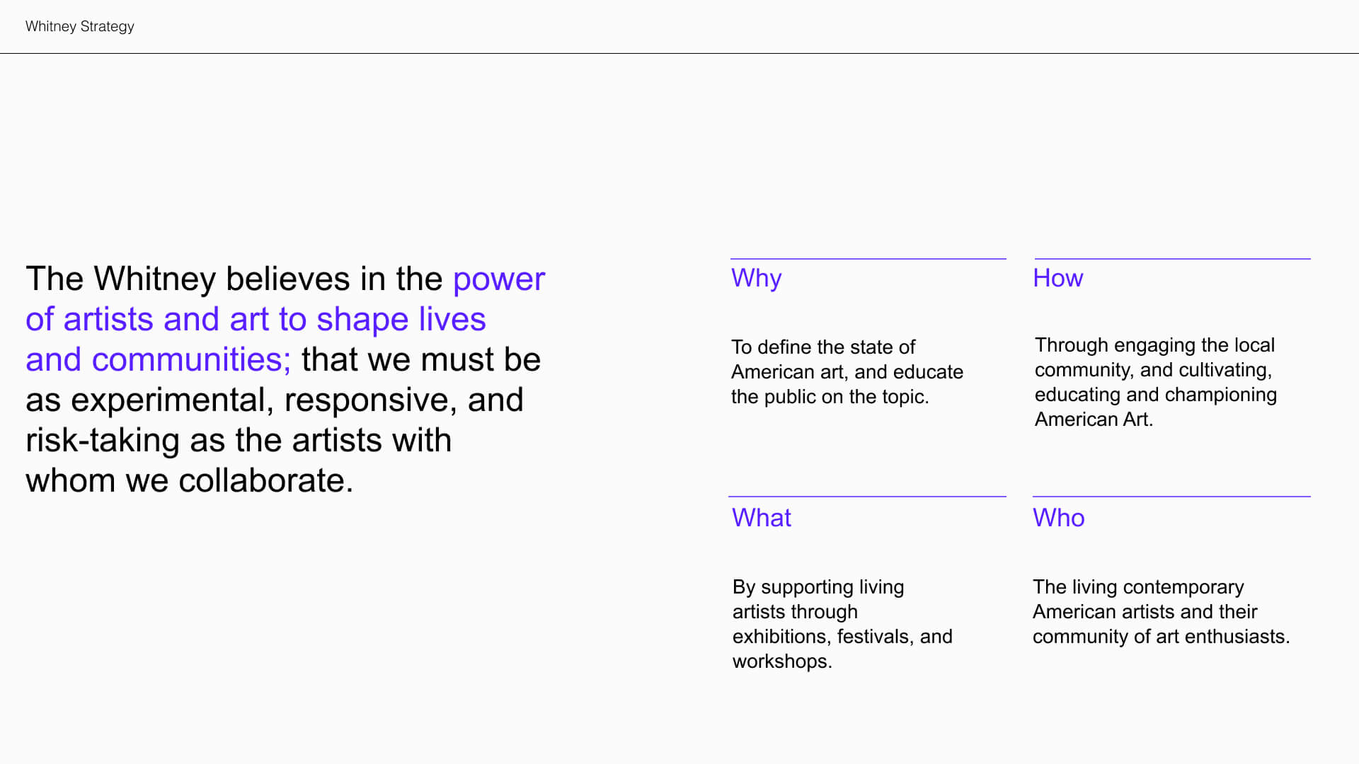
Understanding the Brand
To understand the core of the Whitney Museum, we used the framework of Simon Sinek's 'Start with Why'. This framed our art direction.
Proposal
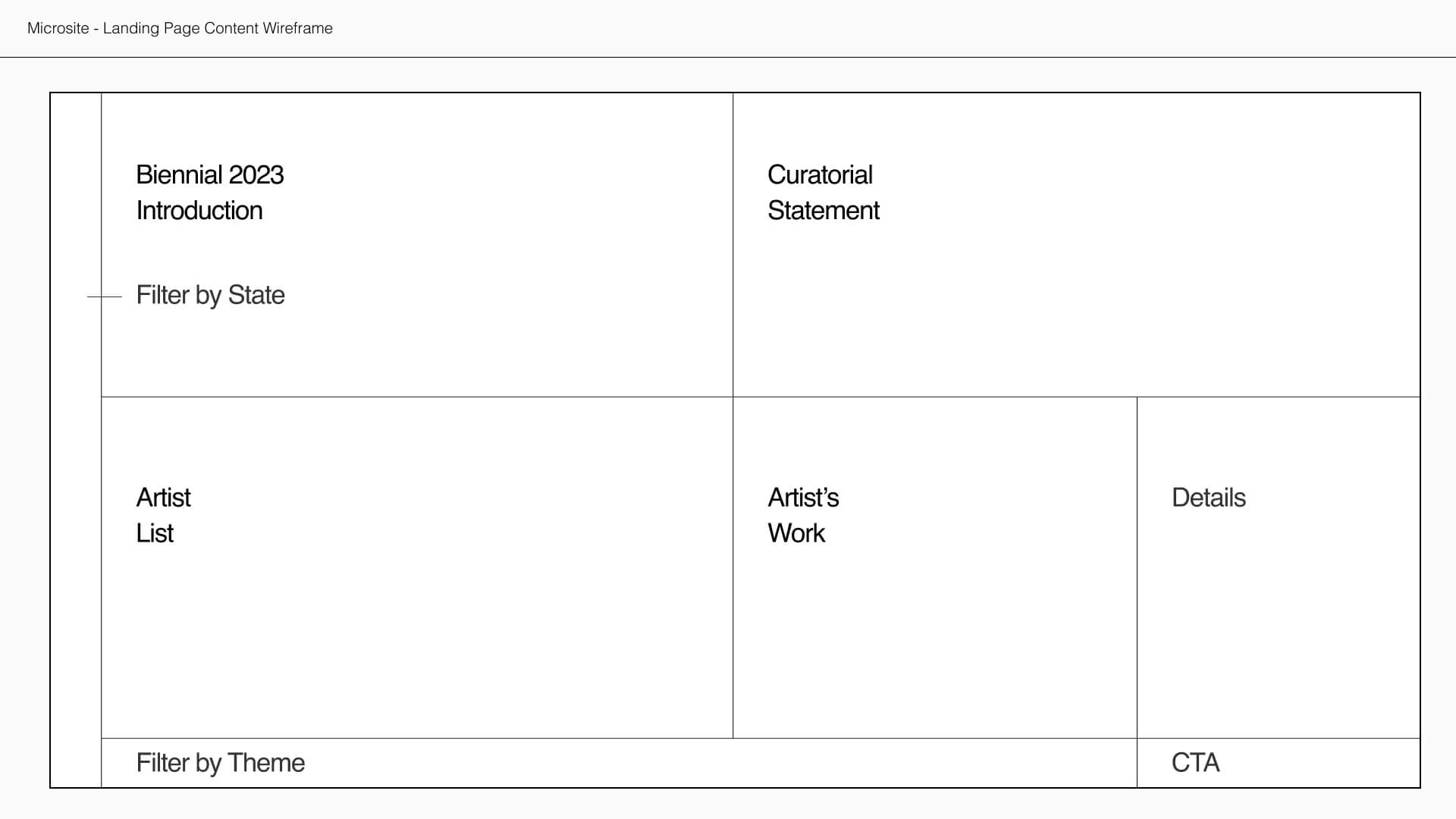
The Whitney Biennial 2022 Microsite
A single screen microsite--Museum visitors explore the site through dragging and resizing the sections to discover more artists and events.
Filtering Artists
Visitors can dynamically filter through the featured artists by US State and artwork theme.
Discovering Artists
Upon selecting an artist, they can preview some of their work for the upcoming show.
Purchasing Tickets
Visitors are encouraged to purchase their museum tickets upon finding artists they are interested in visiting.
Concept
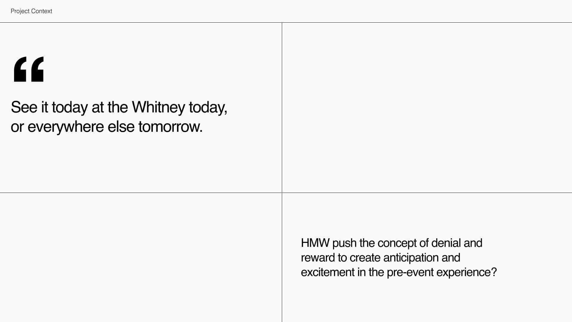
The visual design was inspired by the quirkiness and mysterious tone that the Whitney exhibited in some of their marketing material. One quote stood out to us in particular:
"See it today at the Whitney, or see it tomorrow everywhere else."
We felt that this anticipation could be communicated through the visual quality of denial and reward, so we asked:
How might we push the concept of denial and reward throughout the microsite to create anticipation and excitement in the pre-event experience?
Art Direction
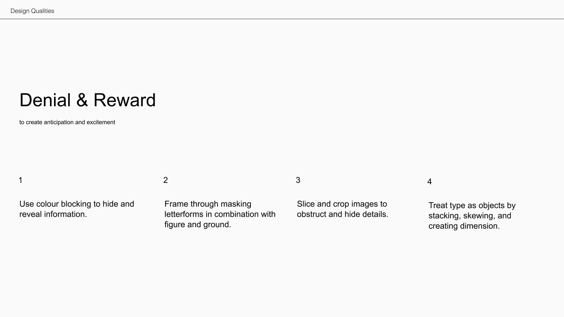
Denial & Reward
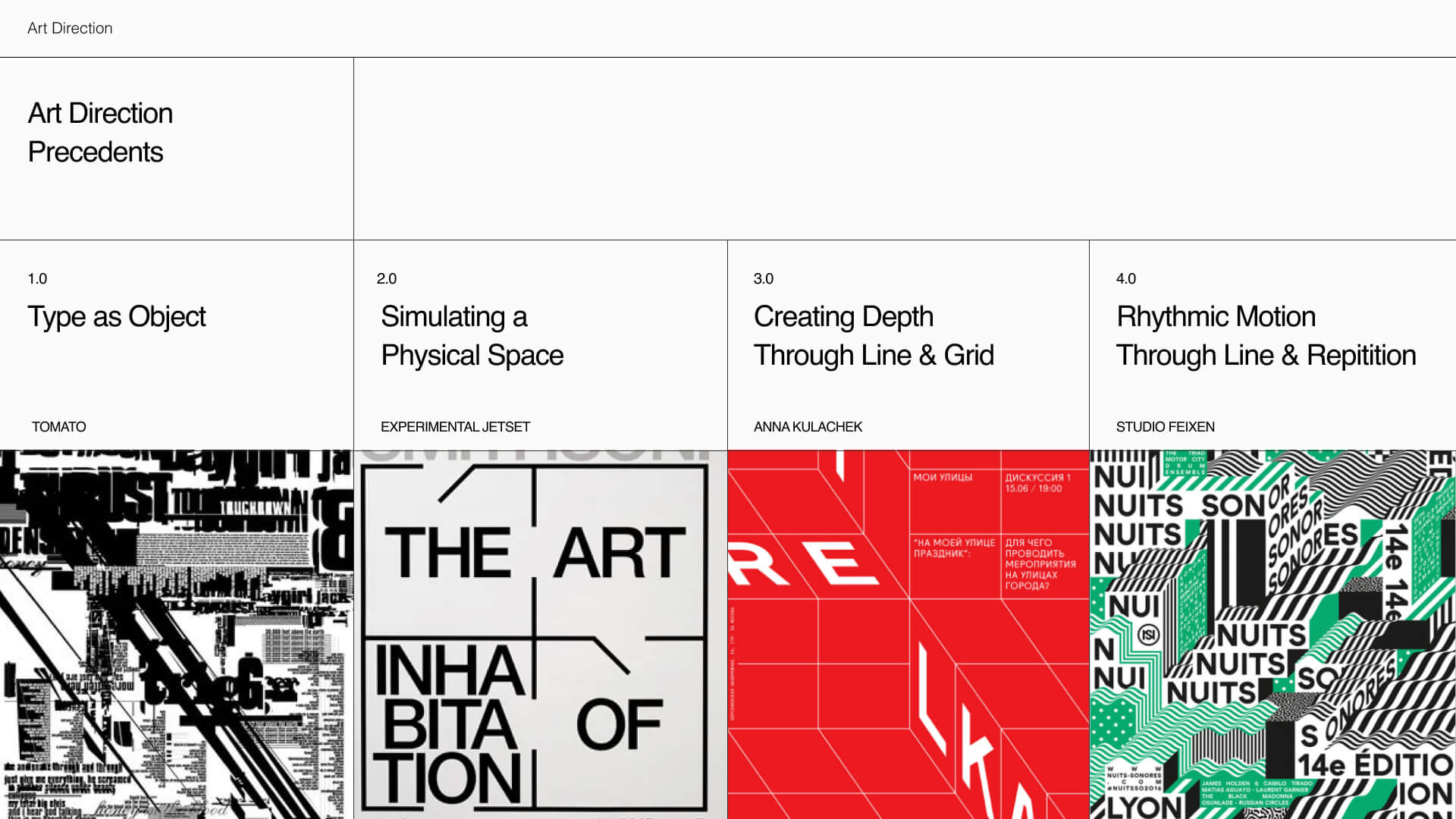
We started this project with a design driven approach, pulling design qualities and principles from design studios to drive our art direction. From our research, these were the qualities we decided to follow through with.
- Type as object
- Simulating a shysical space
- Depth through line and grid
- Rhythm motion through line and repetition
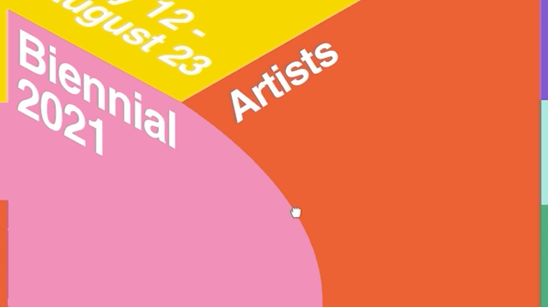
Round 1: Lateral Explorations
Our explorations focused on pushing Denial and Reward, we found that Type as Objects (C) was our strongest direction to pull forward as it captured the essence of New York atmosphere with all its moving parts.
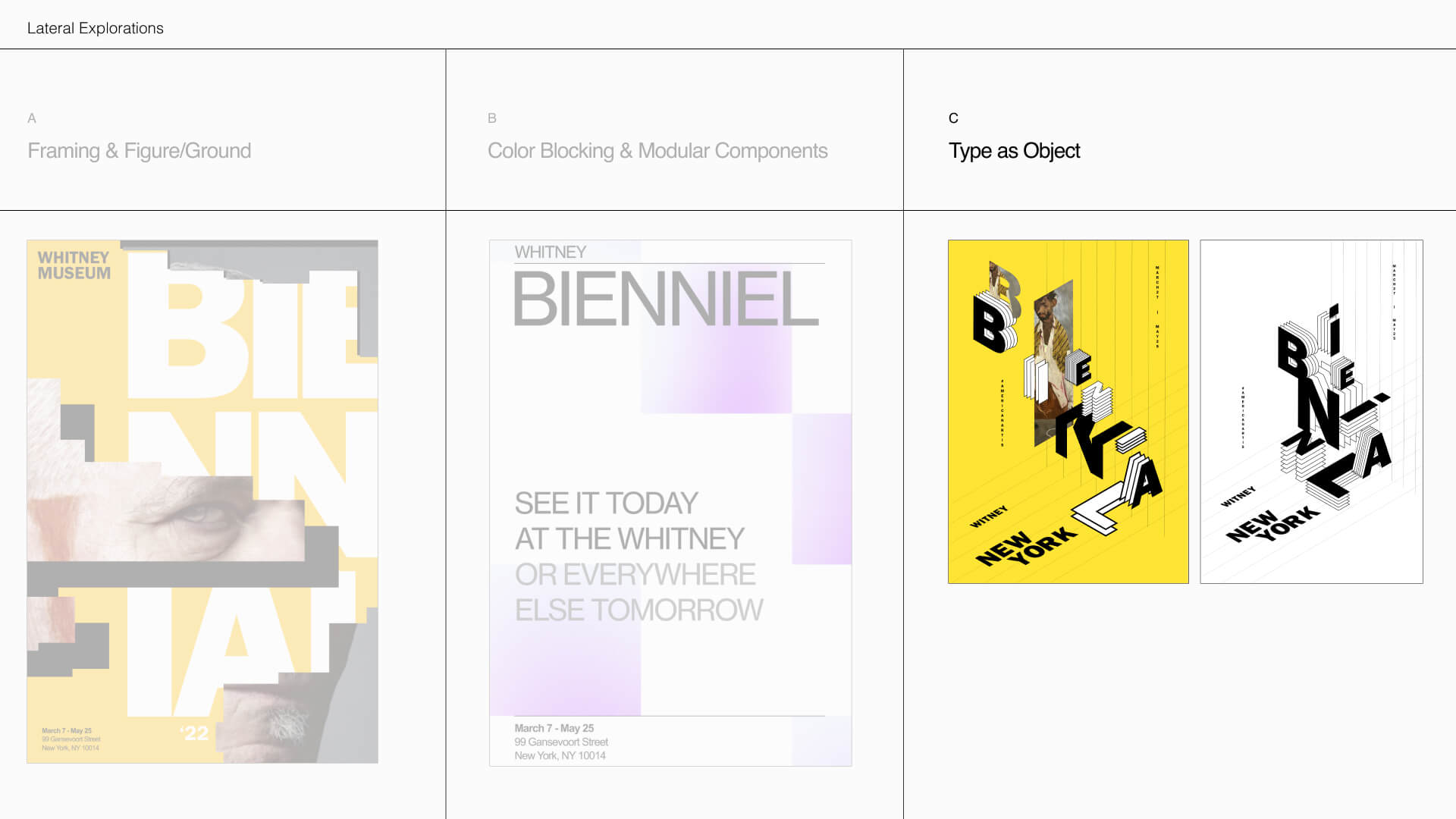
The 3 Lateral Approaches
I worked directly on approach C, conducting studies on Type as Objects that framed the third direction.
Round 2: Lateral Explorations within Type as Objects
We explored different variations of color and type objects but decided that the monochromatic scheme of exploration C was the best; it conveyed more sophistication than the bright playful colors and the type objects had more structure.
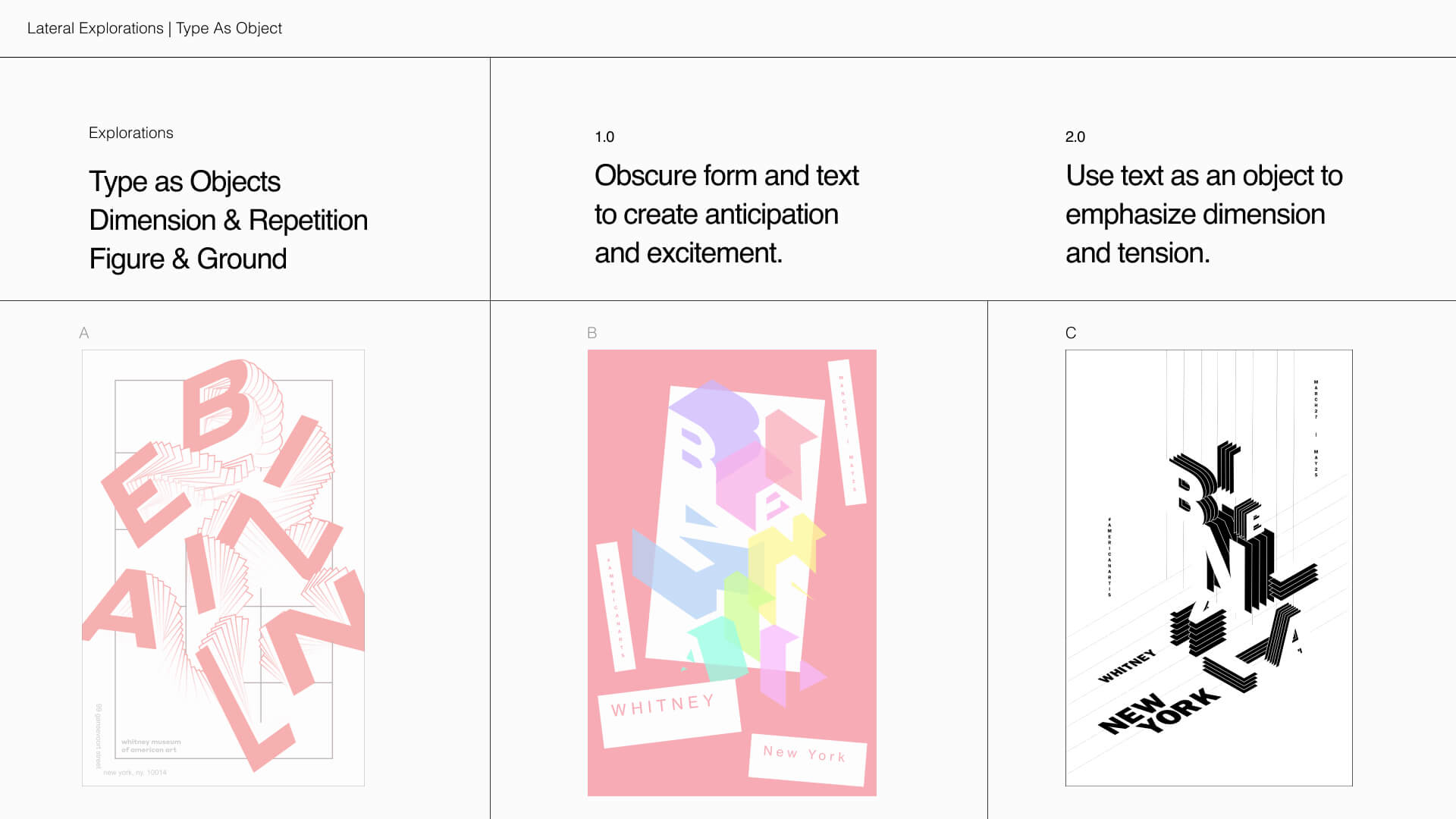
3 Explorations within Type as Objects
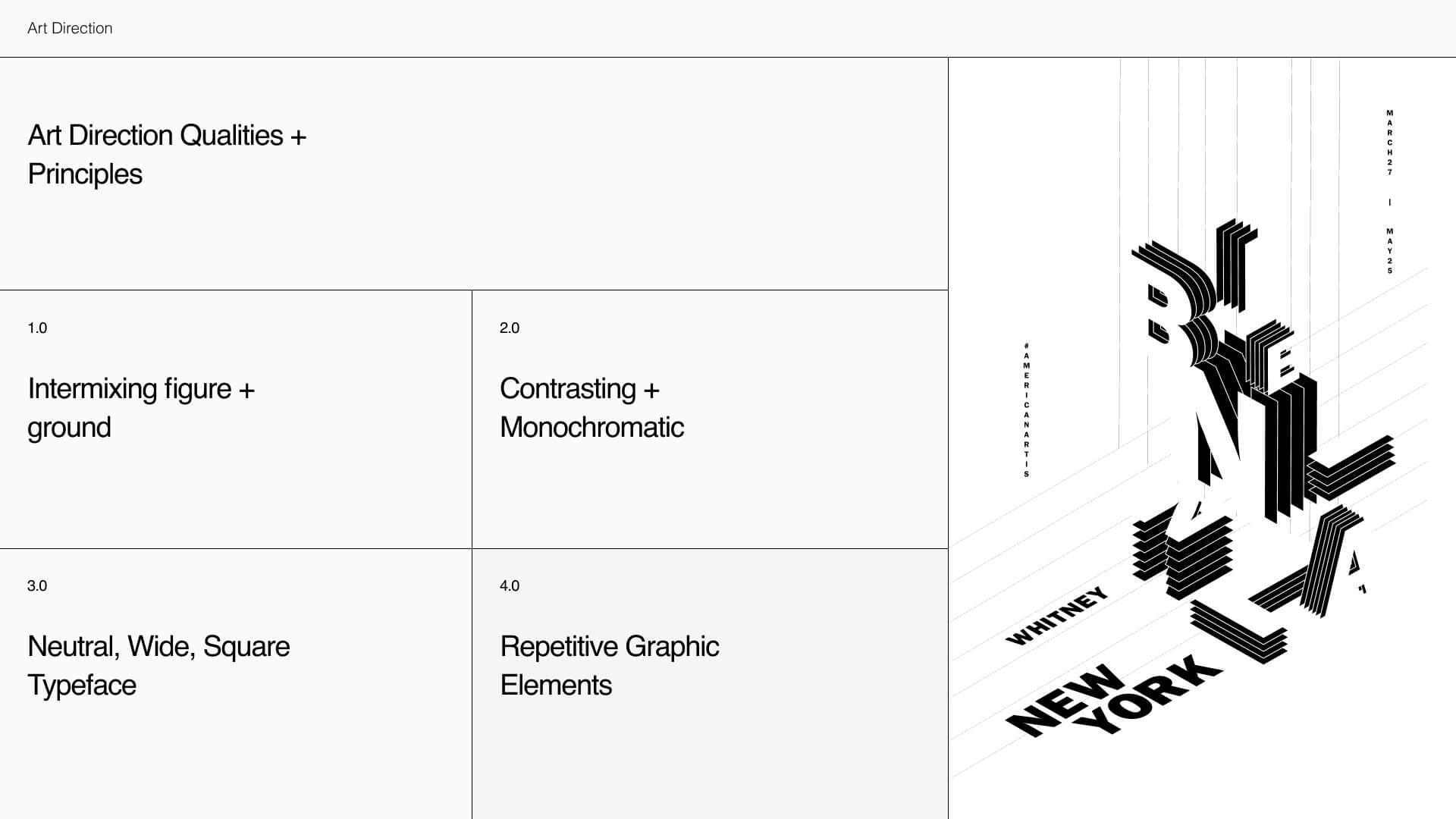
Final Art Direction: Sophisticated, Bold, Mysterious
We chose to push the following qualities and principles forward because they introduced more expression and mystery, while also retaining the sophistication of the Whitney brand.
- Intermixing figure and ground
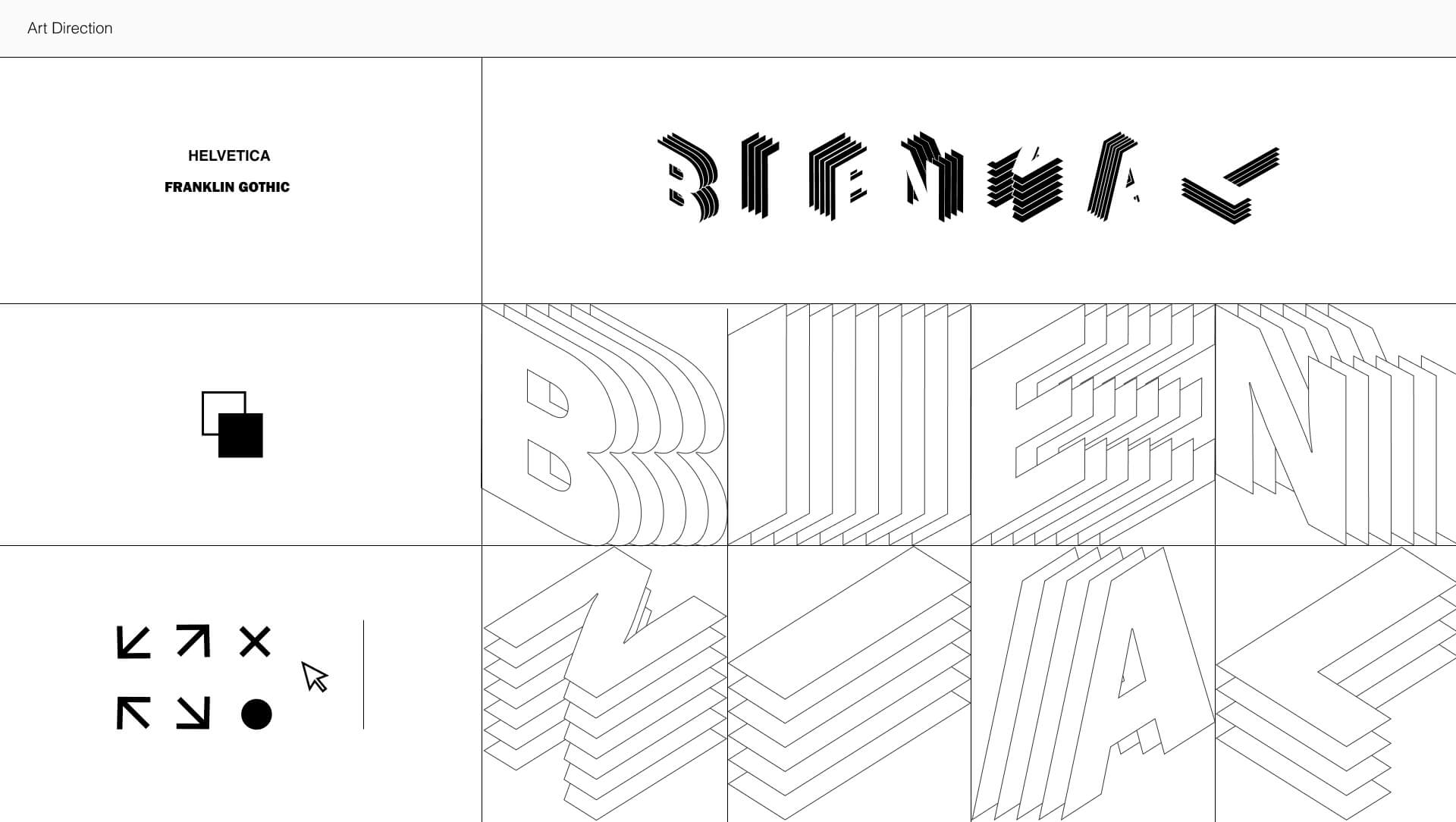
- Contrasting & Monochromatic Shades
- Neutral, Wide, Square Typeface
- Repetitive Graphic Elements
Content Strategy
Surfacing Artists
I led the team in synthesizing the content strategy. The objective was to place the artists as the emphasis and allow visitors to become excited about artists they are passionate about.
Strategy
- Organize the content to drive the discovery of new artists for the Biennial
- Bring denial and reward into the reveal of content
- Utilize a text-driven, structured approach
- Surface artists through filtering
Interactions
Exploring Spatial Continuity
I lead the framing of the interaction study. From precedents, I found that spatial continuity could emphasize denial and reward because it controls the pacing and revealing of content.
We developed 3 different approaches within Spatial Continuity to gauge how expressive the interactions could be.
- Obscuration
- Dimensionality
- Dolly & Zoom
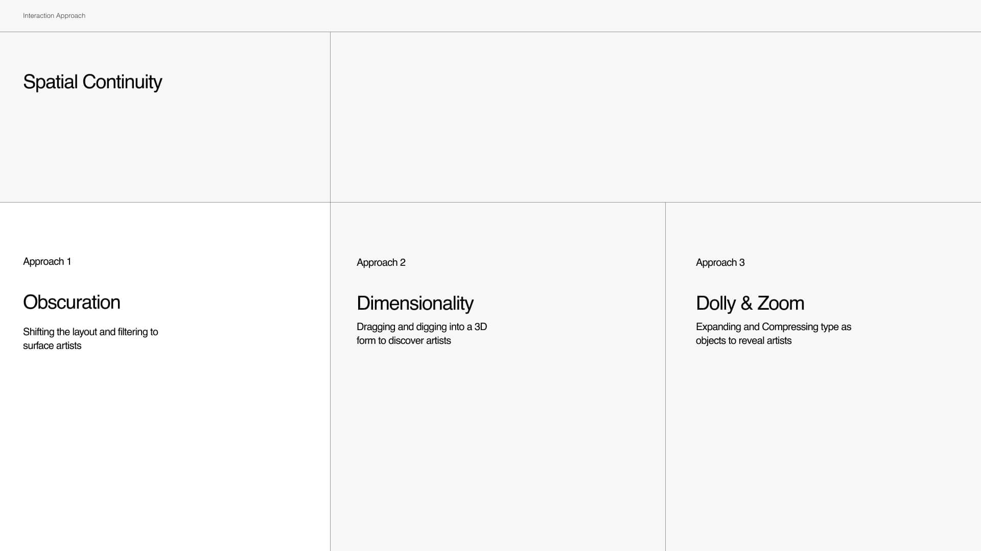
A. Obscuration
Shifting the layout and filtering to surface artists
B. Dimensionality
Dragging and Digging into a 3D form to discover artists.
C. Dolly & Zoom
Expanding and compressing type as objects to reveal artists.
I explored with reactive mouse hover elements to see how more expression could be communicated through treating type as objects in their interactions. View my Study on Reactive Type Interactions
Final Interaction Approach: Dragging & Obscuration
For the final interactions we chose the more functional approach of Obscuration (1) for navigating the website.
The expressiveness of the other two directions made it difficult to navigate, so Obscuration (1) allowed the artists to be surfaced faster while still incorporating the quality of Denial and Reward.
Dragging
To redirect attention and adjust content hierarchy accordingly within each section
Obscuration
Hiding content to encourage exploration and interaction.
Sliding & Scaling
Acts as a transition to reveal new elements and invite interactions.
Micro-Interactions
Brand Expression
The micro-interactions were used to bring back the more expressive interactions such as repetition and scaling. This brought the quirkiness of the Whitney Museum without compromising the functionality.
From the study on micro-interactions I conducted, we found that keeping the simple yet repetitive elements complemented the rest of the art direction.
Reflection
Leading with Design Qualities
This project was different because we started with a design quality driven approach. It was refreshing to explore different lateral approaches from functional to expressive. I learned that this approach allows one to arrive at a final form that is more expressive and unified with the design concept at its core.
Prototype Enough to Communicate
For the purpose of this course, a fully functional interactive prototype was not required. In less than half a day, I rapidly switched between animating in Figma and After Effects for the Artist Filtering and Viewing section. I would have liked to have prototyped the interactions fully in Principle, but given the time constraints, they worked to communicate the concept.